
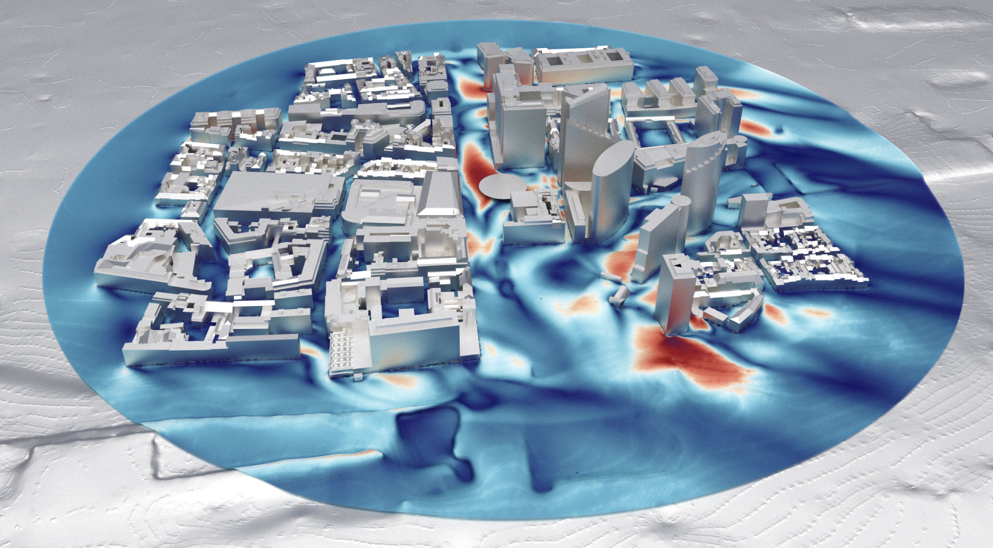
What the colours are
Each point of the map carries a comfort grade, computed from how many hours per year the wind at that point exceeds a threshold. Under NEN 8100 the threshold is 5 metres per second, and the grades run from A (exceeded less than 2.5 percent of the year) to E (exceeded more than 20 percent). The grade is then judged against the intended use: an A or B location suits a terrace, a C is fine for walking but poor for sitting, a D or E belongs on no route people must use daily.
The map is statistics, not a snapshot: it encodes years of local wind data, all directions, weighted by how often each direction actually blows. That is why a spot can be graded windy even if it was calm the day you visited.
Where to look first
Check the locations where use is fixed and exposure is likely: the main entrances, the corners of the tallest volumes, passages between buildings, terraces and balconies, bus stops and bicycle routes. A poor grade on an open lawn is a footnote. The same grade at a door that everyone must use is a design item.
Then check the safety layer, which uses a much higher threshold, around 15 metres per second. Any location that fails safety is a real liability, and the map tells you exactly where mitigation must go.
Questions worth asking
Which wind climate dataset was used, and over how many years? Are the results graded with the standard your municipality expects? Was the surrounding neighbourhood modelled, including planned developments nearby? And if a corner fails: was the proposed mitigation simulated, and by how much did it improve the grade? A good study answers all of these in the report; this list is mainly useful for knowing what you paid for.
Where this shows up in our work